 The following post is from Australian photographer Neil Creek who is part of the recently launched Fine Art Photoblog, and is participating in Project 365 - a photo a day for a year - on his blog.
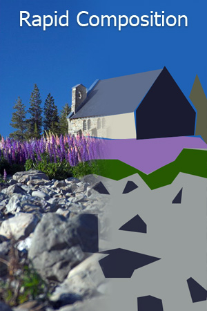
Composing a photograph well can seem to be a mysterious art: hard to master, even harder to explain. Knowledge of the "rules" of photography helps, but who can go through some checklist in their head every time they put eye to viewfinder? The real world waits for no one, and if you delay to think through every compositional possibility, you can easily miss the moment.
In the five years I've been pursuing photography, I've found that I've gone through a progression of not thinking about composition, to thinking too much, back to not thinking so much. Or at least it seems like I'm not thinking much. I've practiced "seeing" the photo before I take it so many times that it's become a reflex, and nowadays I find myself rapidly assessing a scene, considering possibilities and picturing the shot before I even look through the camera.
I find that when I see a possible subject for an interesting shot, I disengage part of my brain, and I ignore the details. My eyes flick over the scene, looking for shapes, patterns, colours, light and form. I shuffle these elements around in my mind's eye and see how they fit together. In this way I quickly and almost sub-consciously get a feel for the scene and composing a photo becomes a more natural process.
How do I do this? Recently I visited a local art gallery and explored the grounds looking for some interesting scenes to illustrate what I mean. Below you will see three different scenes. For each scene I have illustrated and annotated my thought process.
Starting wide I assess the big picture, then I zoom in on the photo I want. I describe what compositional elements I think are important in the final photos and I try to explain why. These are a look inside my head as I go through the thought process of capturing a photograph.
Flowers and Rubber Duckie
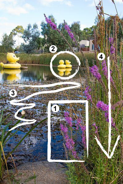 1. Oooh! Pretty flowers! They're down pretty low to the ground, and the wind's blowing around a lot. I'd better go to Shutter Priority to freeze the movement. So if I'm shooting low, what's going to be in the background?
2. Well those ducks sure are different! That could make an interesting splash of colour behind the flowers, but it might be cool to blur them in the DOF so it's not really obvious what they are.
3. Ugh, the pond's a bit overgrown, and there's garbage floating in it. Gotta make sure that's not visible. The low angle and narrow DOF will help that.
4. Alright then, time to get down on the ground and see how it looks through the viewfinder.
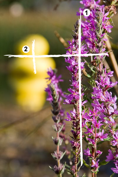
Zooming In
1. Ahh this has potential. Ok, get down REAL low, hold those reeds in the background back a bit with my foot, balance the "mass" of the flowers around the right one third line.
2. Great, opening up the aperture blurs the overgrown pond, and the ducks are nice and ambiguous. Lets put them on the top left intersection of thirds. Wait for the sun to come out. Waiting, waiting…. *click*
Have a look at the result:

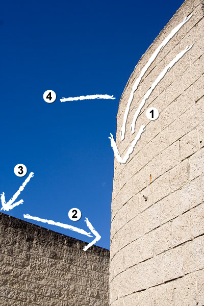
Bricks Before Blue
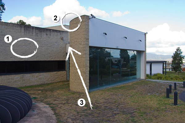
1. This building may have potential, but it's looking pretty bland at the moment, especially with the sun behind the clouds. Those bricks have great texture though, and that wall will be lit from a low angle, which will bring it right out.
2. That curved wall is unusual too, I wonder how I could bring those two elements together, and eliminate all the boring stuff?
3. Maybe a low angle looking up past the curve into the sky could make for an interesting geometric minimalist photo.
Zooming In
1. Looking good! The sun makes a big difference. The curved lines of the bricks are leading the eye nicely into the centre of the image.
2. This wall is showing the texture I had hoped, and it looks great against the blue. The lines also lead the eye right into the centre of shot.
3. Okay, lets position the top of that wall so it's entering shot on the bottom third.
4. Now where to put the curved wall? Ok the top edge can just dissappear out the corner, and I'll put the part where the curve really gets going on the top third line. *click*
Have a look at the result:

Clouds Reflected
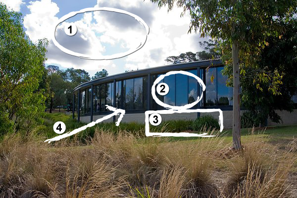
1. Hmmm, the sky's looking pretty nice at the moment. It would be nice to work that into a shot somehow.
2. That reflective wall of windows is pretty cool too, ahh and they're reflecting the clouds from the other direction too.
3. It might be nice to use those bushes to frame the shot too, and contrast the blue of the sky.
4. If I go over to that path, I can look right up to those windows and the clouds beyond.
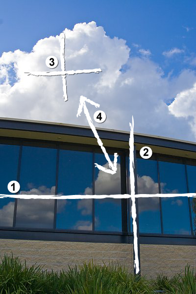
Zooming In
1. This could be tricky to expose, I'd better go a stop under the metered exposure to avoid burning out the sky. I can pull the bottom half back up in Lightroom. So, lets put those windows around the bottom third line.
2. That post can go on the right third line, and I'll make that my vertical as well.
3. Nice! I can put that large cloud right around the top left thirds intersection.
4. And now we've got a cool recursive cloud thing going on in the reflection, and it's even helping balance the composition around the centre. *click*
Have a look at the result:

Thinking about a composition can really help make better photos, but dwelling on rules and technicalities can cause missed opportunities. The best way to find a happy balance is to get out and practice. Shoot heaps of photos, and do it often. Even if you don't have your camera with you, if you see something that would make an interesting shot, close one eye and imagine how you would compose it. You don't need a camera to practice photography!
Pretty soon you'll find yourself rapidly composing photos, and you'll barely be conscious of it.
In addition to posting his Project 365 photos to his blog, Neil also runs a monthly photography project. This month's topic is all about The View From Below.
Read more posts like 'Rapid Composition - How to Compose a Photo Quickly'

18 Responses to "Rapid Composition - How to Compose a Photo Quickly"
- Vladislav Says:
February 14th, 2008 at 12:35 am Nice hint.
But I think this tips with regular practice - is more effective combination!
Thank's for nice article and nice site ;-)
- My Camera World Says:
February 14th, 2008 at 1:11 am Neil:
This is a great article you have wrttin to illustrate how to think and composition and finding the right elements in scenes around us.
As you may know I am a big fan of marking up images to show the though process in analyzing scenes or photographic images.
While looking at great images is always wonderful, I think the mark-up process really helps people understand how to get these great images.
Niels Henriksen
- Lee Says:
February 14th, 2008 at 1:17 am Excellent article. This reflects the process that I've been using for a long time without even realizing it. I'm learning something about the "rules" of photography all the time. In many ways, I've been intuitively doing things correctly and picking up the rules later. Probably not the best way to go about learning photography.
- Smitty Says:
February 14th, 2008 at 1:31 am Great article, Neil!
As a novice, I'm really beginning to see all of the interesting subjects around me, but am having a tough time figuring out how to put them together into interesting and compelling compositions. I loved seeing your brain in action as you went from an ordinary and boring photo to something far better!
I would love to see more of these…
- Thomas Says:
February 14th, 2008 at 2:32 am Well the rules are okay one thing i dislike with your guide is that it would be better to show a before picture A which is bad and a similar photo B which is good. All your A pictures have different angle,content and meaning if you like.
Picture of House taken bad way -> Picture of House taken good way, would be better !
- HeyJules Says:
February 14th, 2008 at 2:52 am Fantastic explanation of how we do what we do (or how we should be doing it!) I think I do most of this in my head also but probably not as well thought out as you do so this really helped me think about how to do an even better job of composition.
- Canadian Mum Says:
February 14th, 2008 at 3:29 am Great article. I really appreciate the before and after photos… describing your steps in finding the right vision.
- geotography Says:
February 14th, 2008 at 3:36 am Superb Piece! Thank you for your generous offering.
- KRIS Says:
February 14th, 2008 at 3:50 am GREAT CHAIN OF THOUGHTS PRO. IT IS A COMMON SAYING A PAINTER PAINTS A SCENE IN HIS MIND FIRST, BEFORE HE EVEN OPENS THE CANVAS. YOUR IDEAS ARE ON SIMILAR LINES. IF THE MIND IS FOCUSSED THEN ALL THE OTHER THINGS JUST FOLLOW.
GREAT POST AND A MIND OPENER.
THANKS,
KRIS
- Paul Says:
February 14th, 2008 at 3:53 am Superb article. Even if the end products aren't all to my liking the way the 'thought process' is explained is brilliant. It says 'look first shoot second' it says if you find something you like think about how you can get it to into a shot in an interesting way. Really really good article
- Jack Says:
February 14th, 2008 at 4:08 am Thank you very much for doing this article. I cannot say that I have been doing this for years. I am still trying to learn how to take a decent picture. My knowledgeable photography friends tell me that I should watch where my wife stands since her pictures are much more interesting than mine. But this "explore the thought process" approach is even more helpful. Thank you for doing it.
- Klaidas Says:
February 14th, 2008 at 4:54 am A very well written article, with inspiring examples. Was fun to guess what the end shot will look like after seeing the surroundings :]
- Chris Homan Says:
February 14th, 2008 at 5:16 am Great article!!! This really addressed a question I had been struggling with for a while. Wonderful!
- Flavio Says:
February 14th, 2008 at 6:03 am Best article! Creative, technicall, simple, …
The best article so far. And I thought you couldn't come with something new afterall…
- AC Says:
February 14th, 2008 at 7:05 am Excellent article. I really liked the way the reasoning behind the snaps was explained. Also, the transition from bland to beautiful is brilliant.
- don jonson Says:
February 14th, 2008 at 7:08 am Very useful and good article. I like how its explained in a way everyone will understand!
- Joey Rico Says:
February 14th, 2008 at 2:48 pm wow great article!!!!! very helpful!!!!!
- Simon Says:
February 14th, 2008 at 3:51 pm Article of the year so far.
Leave a Reply