| 
You can get decent photos out of a standard, consumer-grade digital camera, but a little post-processing can turn them into fantastic wide-angle landscapes. You don't need to be one of those people who can explain the concept of lateral chromatic aberration to get truly eye-catching digital pictures. With a few shutter clicks and some free, cross-platform software, you can easily mesh standard digi-cam shots into true landscapes, fix one photo's deficiencies with another, and create layered photo collages. Let's take a look at how to use the free, open source application Hugin to make two basic kinds of panoramas.
What you'll need- A digital camera that embeds EXIF data in its pictures (that's basically all of them)
- A copy of Hugin (available for Windows, Mac, and Linux). If you're on Windows or Linux, you should also grab a copy of the AutoPano tools; Mac OS X users should have AutoPano tools built in. Follow the instructions at the Hugin site to install your copy.
What you'll get Here's an example of the kind of photo you'll get from this process. Even though I shot this three-frame scene at Niagara Falls (from the U.S. side) in automatic mode, it still came out pretty spiffy, if I do say so myself. (Click for a larger version.)  Now let's get started making your panorama. Now let's get started making your panorama. Shooting for panoramas With Hugin's software, you can blend two side-by-side photos together, or you can cram 138 multi-angle Grand Canyon shots into one mega-vista. Whatever your project, here are some guides and tips on how to shoot to best take advantage of Hugin—and most any panorama-stitching software.  - Use consistent settings—If possible, change your "white balance" to a manual mode and set it to a plainly white or gray spot; if not, at least change from "auto white-balancing" to an another setting that works. Better still, if you can set exposure to manual, meter it for the brightest or most average spot in the scene. Neither is a requirement, but they'll help your finished product blend more evenly.
- Choose a center point—Find the feature or area you think would look good in the center and take steady aim, at the same zoom level you'll shoot the rest. It'll help you align your pictures later and ensure you've got space to build on.
 - Shoot overlapping shots in ordered rows—If you're going for a horizontal-only panorama, go left to right, in a steady row, with 20-30 percent of the picture overlapping the last one, then do the same for higher or lower rows. Not only does it help you keep your shots organized, it counters the sometimes fuzzy or unfocused data many consumer cameras get at their exposure edges.
First steps: Merge a few pictures We'll start simple, with two, three, or four pictures, shot in horizontal order. Load up Hugin, and you'll notice a series of tabs. Hit the "Load Images" button on the first "Assistant" tab, select your pics, and hit "Open." First-timers might get a prompt asking them to locate an AutoPano program—go ahead and point inside the folder you downloaded, but don't worry if you don't have it. Ignore the "Panorama Preview" that pops up and head for the second tab, "Images."  Remember that center image we took? Find it in the list, then hit the "Anchor this image for position" button, and, assuming it's a well-lit shot, "Anchor this image for exposure." Next up is an optional step, for those who know a fair deal about their camera—head to the "Camera & Lens" tab, click on the center image, and fill in what you know about your gear's degrees of view, focal length, color offsets, and other photo-pro stuff. You can save your information here for future panoramas. Once you're done (or lost), let's head to the meaty stuff at the "Control Points" tab. Remember that center image we took? Find it in the list, then hit the "Anchor this image for position" button, and, assuming it's a well-lit shot, "Anchor this image for exposure." Next up is an optional step, for those who know a fair deal about their camera—head to the "Camera & Lens" tab, click on the center image, and fill in what you know about your gear's degrees of view, focal length, color offsets, and other photo-pro stuff. You can save your information here for future panoramas. Once you're done (or lost), let's head to the meaty stuff at the "Control Points" tab.
You'll see two panels here, each set (at first) to display the same picture. Click the "1" tab on the right-hand panel, and you'll see your overlapping pictures. If AutoPano launched when you loaded your pics, you'll also see a good number of colored dots on the photo. Those are our "Control Points," spots that appear in both frames that Hugin uses to align and combine them.  AutoPano does a decent job sometimes, but it often picks out clouds, cars, blown branches and other moveable objects, which doesn't help anything. For a seamless meld, I wipe out the automatic points (select the first in the list at bottom and jam on the "delete" button on the right) and start fresh. AutoPano does a decent job sometimes, but it often picks out clouds, cars, blown branches and other moveable objects, which doesn't help anything. For a seamless meld, I wipe out the automatic points (select the first in the list at bottom and jam on the "delete" button on the right) and start fresh. Zoom in on the photos (select "100%" or the like from the "View" menu in the lower-right) and move the sliders so you're looking at mostly overlapping areas. Find stable points that have a lot of contrast, such as building and window corners, road markings and signs—anything you're reasonably sure didn't move from one frame to the next. Repeat this process for each set of side-by-side frames. You only need a minimum of two pairs for each photo, but adding a few more ups Hugin's accuracy. Here's how I pinned the Niagara Falls (Ontario) skyline:

Click the "Optimizer" tab and, unless you want to get tweak-y, hitting the "Optimize now!" button, which starts lining up those Control Points and shifting photos around.  To see how Hugin did, hit the "Preview Panorama" menubar button, and you'll get a rough look at your creation. (It won't turn out exactly the same, but basically close). If it looks warped and off-base, you can head back and re-pin or add Control Points, move the crosshairs or use the "Center" and "Straighten" buttons in the preview mode to finesse it. Whenever you make any changes, however, head next to the Optimize tab and re-optimize—you can also change optimization settings to see if that nets any benefits. To see how Hugin did, hit the "Preview Panorama" menubar button, and you'll get a rough look at your creation. (It won't turn out exactly the same, but basically close). If it looks warped and off-base, you can head back and re-pin or add Control Points, move the crosshairs or use the "Center" and "Straighten" buttons in the preview mode to finesse it. Whenever you make any changes, however, head next to the Optimize tab and re-optimize—you can also change optimization settings to see if that nets any benefits.  We're almost there, seriously! If the preview looks decent, head finally to the "Stitcher" tab. The "Projection" setting is the heart of Hugin, telling the program how to bend and shape the output. For a few overlapping photos, "Equirectangular" usually provides the fullest view and best blend, but "Rectilnear" seems best when photos are tightly lined up. Hit "Calculate View of Field" next, keep the Quick Stitcher setting to "with custom settings below," and then hit "Calculate Optimal Size." The numbers will be ludicrously big, so knock one of them down to a standard size. Keep the stitching engine on "Nona," and make sure "Image output file" is "TIFF" and that "soft blending" is checked so the Enblend engine can work its stuff. Tell it where to save, and Hugin gets to work. If you're prompted to point to "Enblend," it's located in its own folder right inside Hugin's directory. Hugin will create temporary TIFF files and work your system pretty hard while it runs, which can take anywhere from seconds to a few minutes, depending on your system. We're almost there, seriously! If the preview looks decent, head finally to the "Stitcher" tab. The "Projection" setting is the heart of Hugin, telling the program how to bend and shape the output. For a few overlapping photos, "Equirectangular" usually provides the fullest view and best blend, but "Rectilnear" seems best when photos are tightly lined up. Hit "Calculate View of Field" next, keep the Quick Stitcher setting to "with custom settings below," and then hit "Calculate Optimal Size." The numbers will be ludicrously big, so knock one of them down to a standard size. Keep the stitching engine on "Nona," and make sure "Image output file" is "TIFF" and that "soft blending" is checked so the Enblend engine can work its stuff. Tell it where to save, and Hugin gets to work. If you're prompted to point to "Enblend," it's located in its own folder right inside Hugin's directory. Hugin will create temporary TIFF files and work your system pretty hard while it runs, which can take anywhere from seconds to a few minutes, depending on your system.
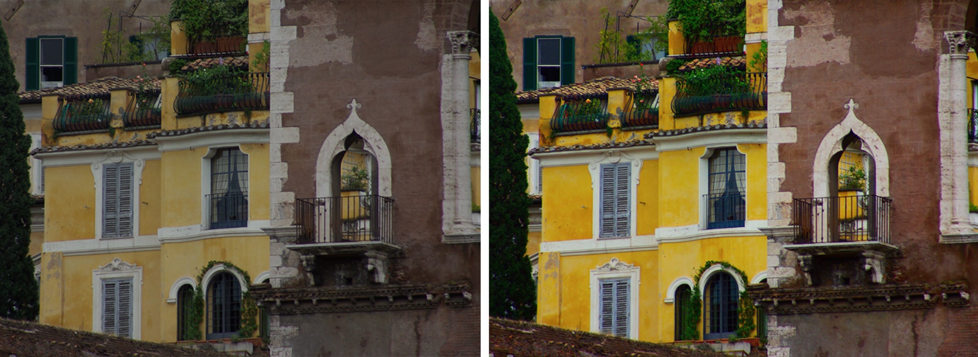
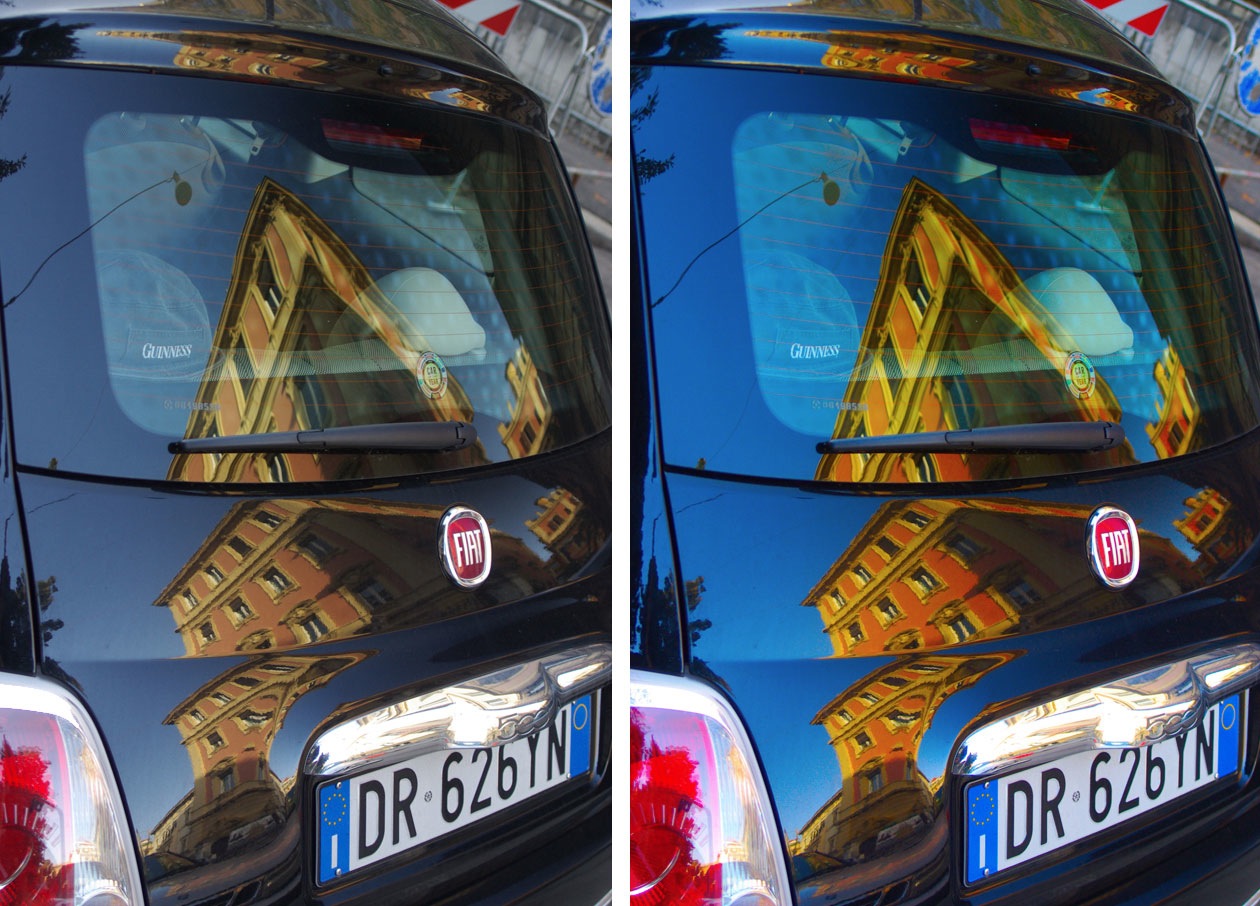
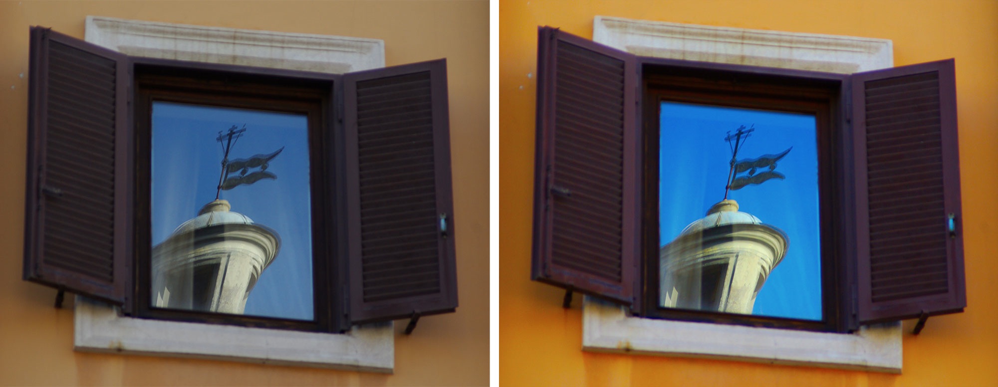
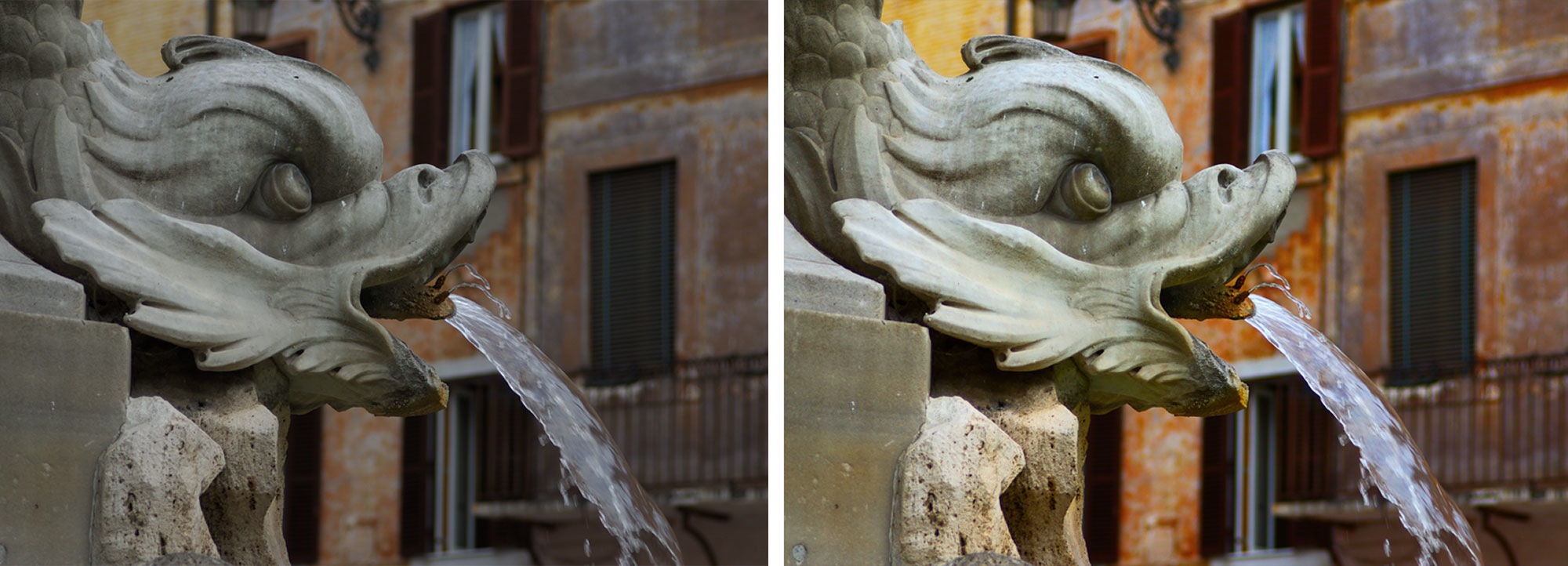
If the resulting image file is discolored in spots, it's likely due to camera settings or stark lighting differences, which, with only a few photos, can be fixed only in post-processing.
Shooting full panoramas If you followed the basic steps above, shooting and stitching a wider-angle panorama scene is much the same, with a few exceptions:  - Shooting—If you're covering a wide area and shooting many more snaps, it's important to stay and pivot in one place and focus on keeping a 20-30% overlap. You'll also want to watch for inconsistencies like cars, pedestrians and other scenes that change, unless you're going for a more artistic paste-collage look
- AutoPano—You'll have to rely on this to create your Control Points, changing them only where you see problems in Preview or want finer control. Of course, you can line up matches for dozens of remarkably-similar pics by hand, but that's up to you.
- Frame pruning—If you've shot a lot of overlapping pictures and want to get rid of a phantom arm, half-car, or anything else, you can easily remove entire frames and likely not damage the scene. Head to the Preview window, click the numbered buttons to toggle frames on and off, hold the mouse on the button to get the file name, then head back to the "Images" tab and remove the file with the right-hand button.
- Stitching—Set the "Projection" setting to "Panorama" if you've covered a wide area, horizontal and vertical, or try other settings, like "Fish eye" for that "Paul's Boutique" look.
After just a little frame-pulling, and having shot with manually-controlled light, I got a panoramic streetscape (my third attempt) to come out pretty decent (click for larger view):

Once you've got the basics down, Hugin has much, much more for you to explore, including tutorials at the home page that show you how to use the app with scanned documents, to create true 360-degree panoramas, and how to get real geeky with the settings. This is the method that worked most consistently for me with different sets of photos. I chose Hugin over previously-posted AutoStitch for its cross-platform nature. But I want to hear how your own tips on how you work Hugin (or similar panorama-making apps) to make big, breathtaking scenes—with image links, naturally. Share your tips, questions and photo pride in the comments. Kevin Purdy, associate editor at Lifehacker, is going to be even more annoyingly shutter-buggy around his friends now. His weekly feature, Open Sourcery, appears every Friday on Lifehacker.   
 |


 Make everyday scenes look like tiny intricate models with this fun Photoshop technique
 Find out why your camera has different quality settings, and how they affect your pictures